
Did You Say...Aphasia? | Design for Real Life
Client | Stroke Hub Wales
Brief
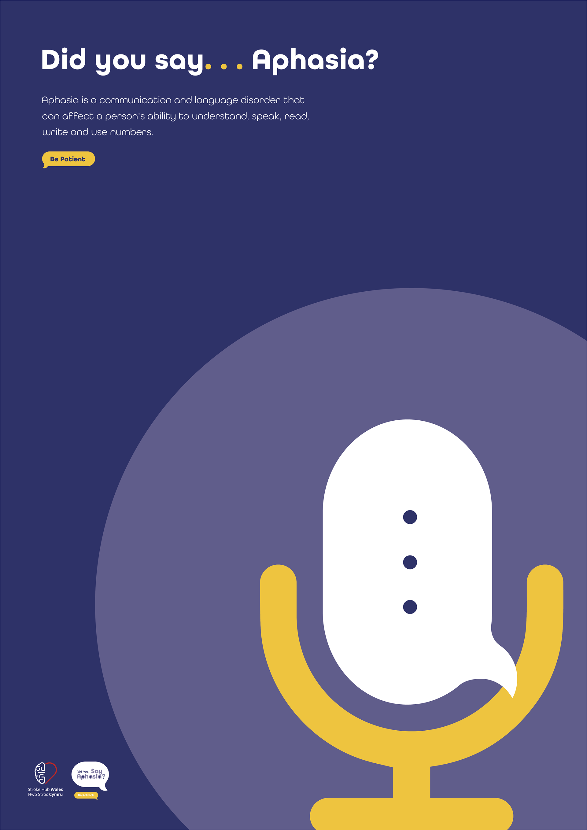
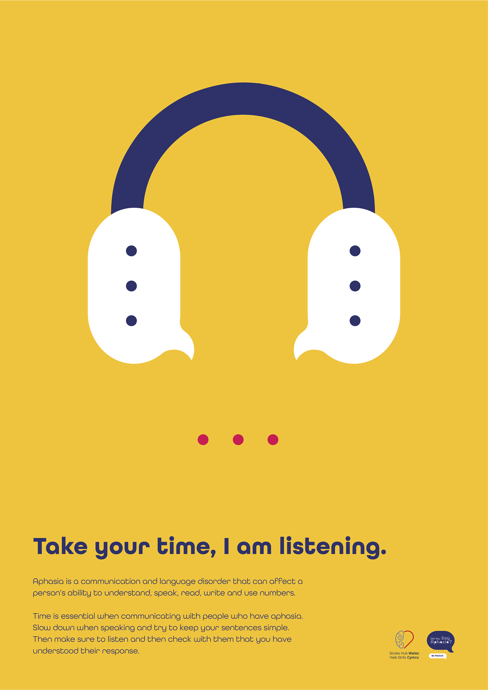
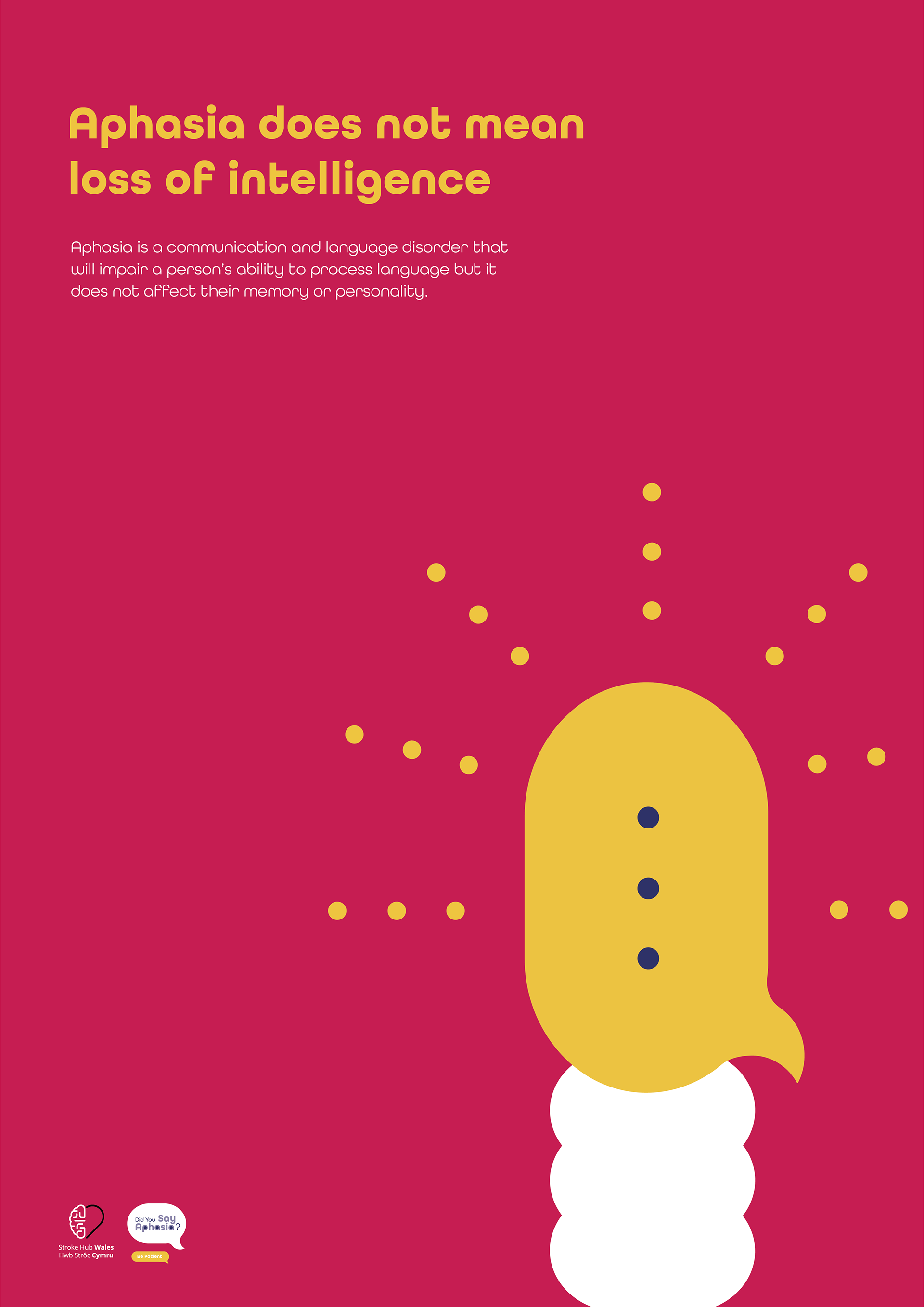
The brief required us to develop a resource that would promote effective communication between the public and people with aphasia. Aphasia is a language and communication disorder which affects more than 350,000 people in the UK. It can affect a person’s ability to understand speech, speak, read, write and use numbers (Stroke Association, 2020).
The project should encourage people to change their behaviours by taking more time to listen and be patient when conversing. By providing the public with good communication strategies we have the opportunity to boost the independence of those with aphasia.
Core Thought - Be Patient
Solution
Research showed that the main reason for poor communication was that 84% of the public had never heard of the term aphasia therefore I made the decision to create a campaign targeting young adults, roughly between the ages of 16 to 35 entering the world of work. The aim being that if awareness of aphasia was raised early on in their careers then we could equip them with the communication strategies needed to improve their public interactions.
The concept for this awareness campaign was the use of an ellipsis. In today’s society, so many people communicate via their mobile devices and an ellipsis is often used on communication platforms to reveal that a communication partner is responding. Therefore it was a familiar visual, with preexisting meanings, that would be intuitively understood by the target audience to be patient and wait for an answer.
When used as punctuation, an ellipsis indicates that information has been left out. This also relates to aphasia as it can often be only the important words, that have meaning, that are expressed by someone with aphasia.
A Responsive Campaign Logo
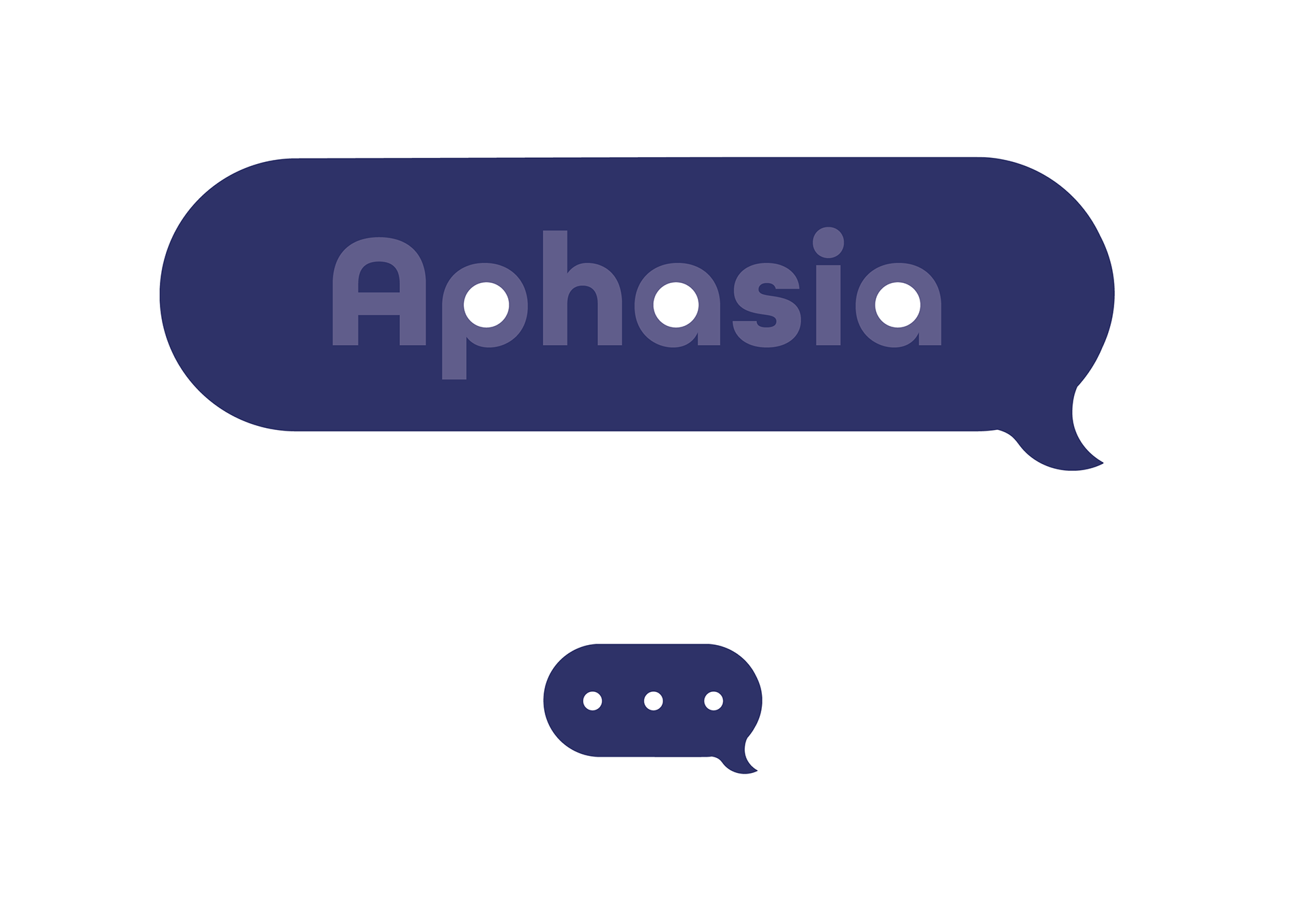
The campaign logo has been designed to be responsive, meaning it can be reduced in size and the audience can still make a connection to the campaign. The shape of the logo is a speech bubble to link to the idea of communication and it also has similar features of a lowercase letter ‘a’ to stand for aphasia.
The word aphasia itself is reduced in opacity to present how aphasia is invisible to the human eye. However, within the digital context that the logo will be used, there is opportunity to gradually build the opacity to 100% as people become educated and learn what aphasia is and means.
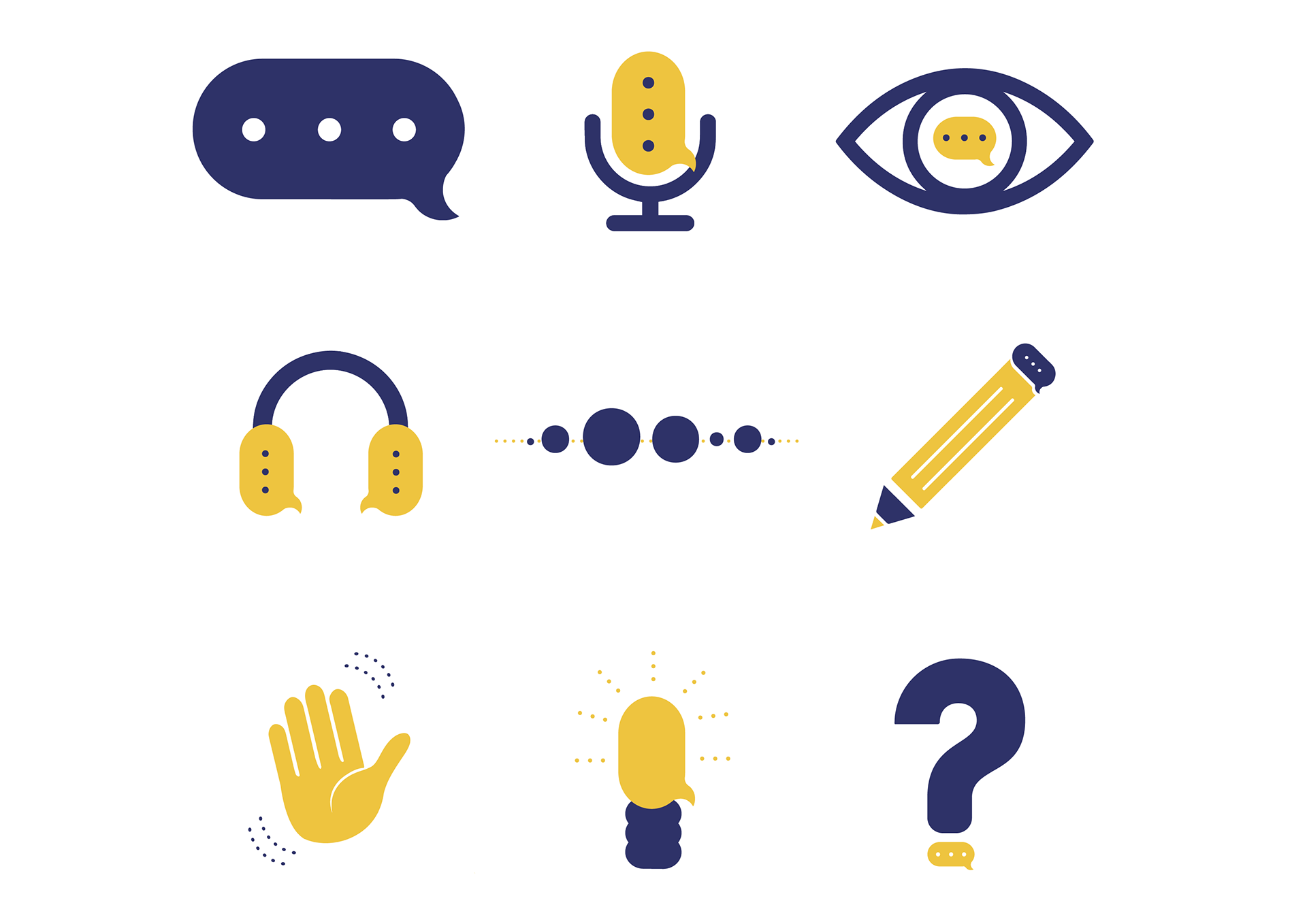
Iconography
Initial Animation Storyboard
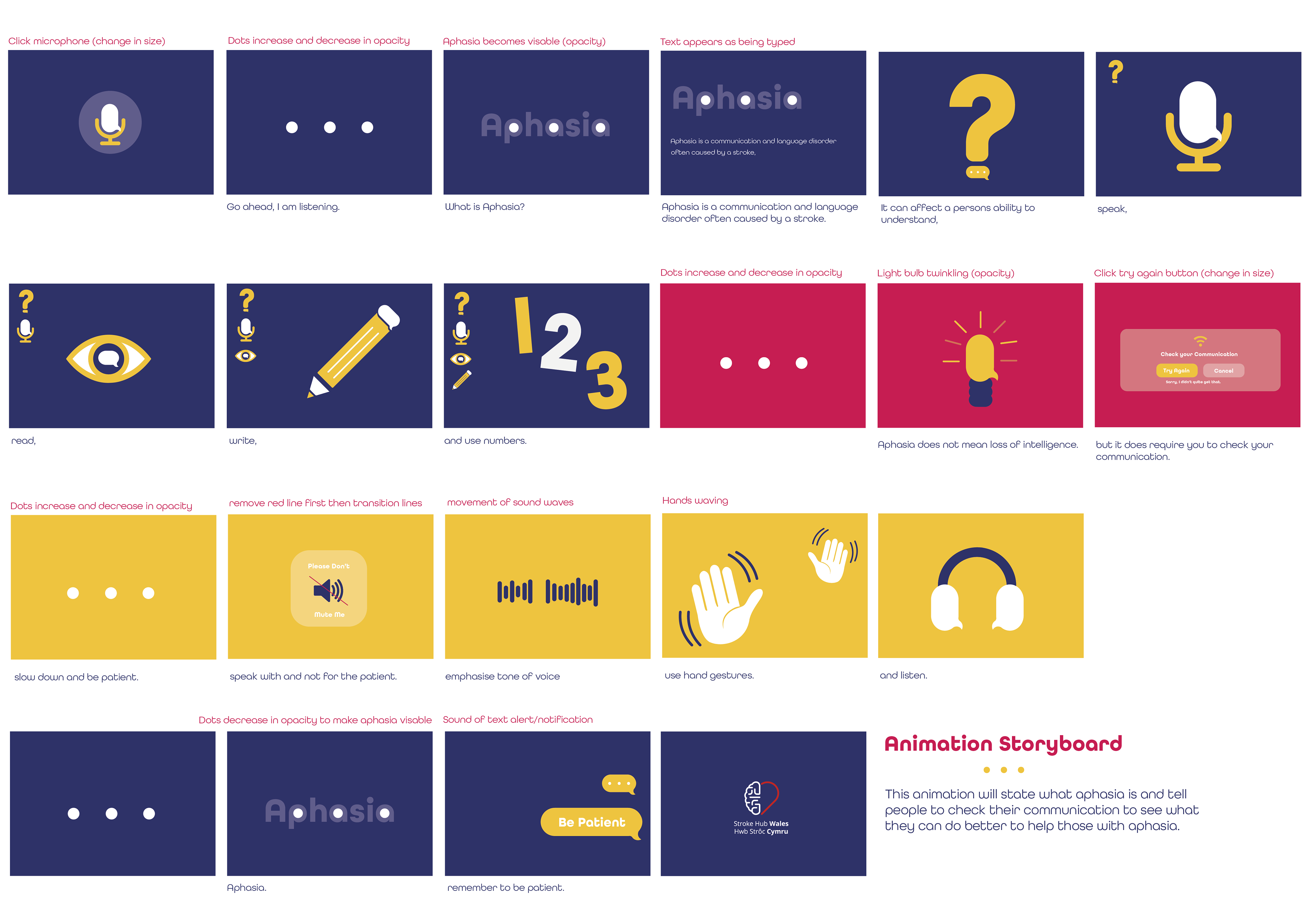
Research shows retention rates are higher if people see and hear information rather than solely rely on reading text based resources.
Instagram Story Digital Information Guides
The campaign uses social media to provide information in manageable, bite-sized chunks. The guides are easy to access via Instagram's story highlight feature.
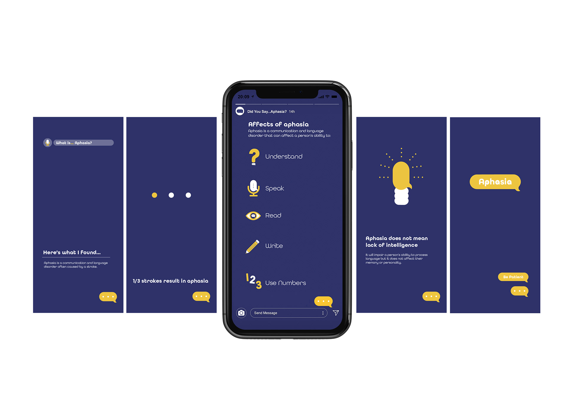
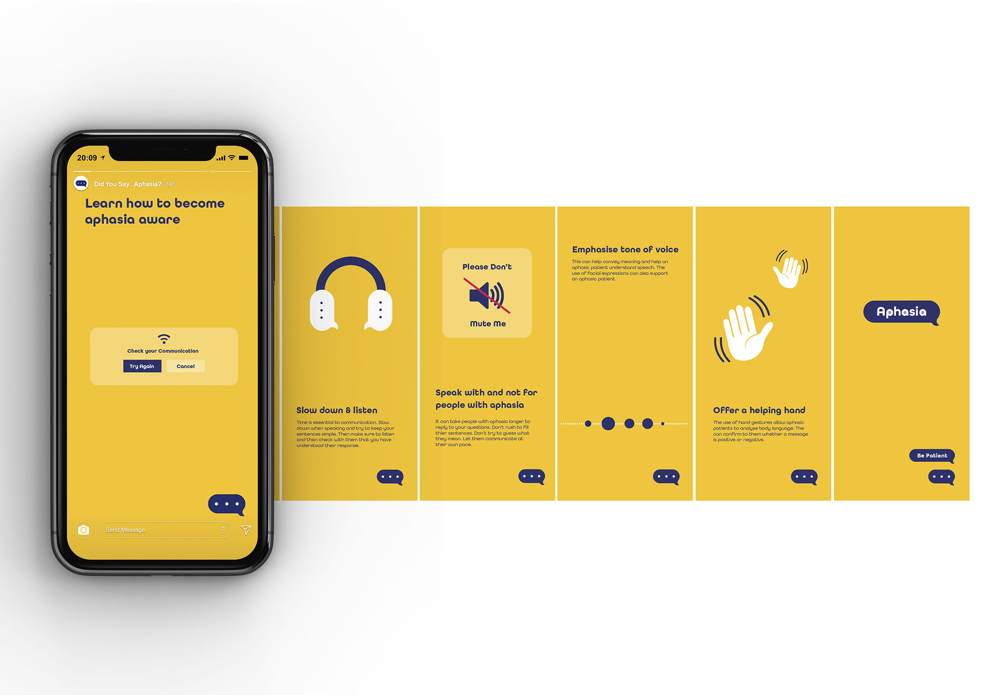
The simple yet significant visuals help explain the science.
Supporting Posters

Awards/Recognition |
Commended Work, Creative Conscience Awards 2021
References
Animation Music comes from https://freesfx.co.uk/